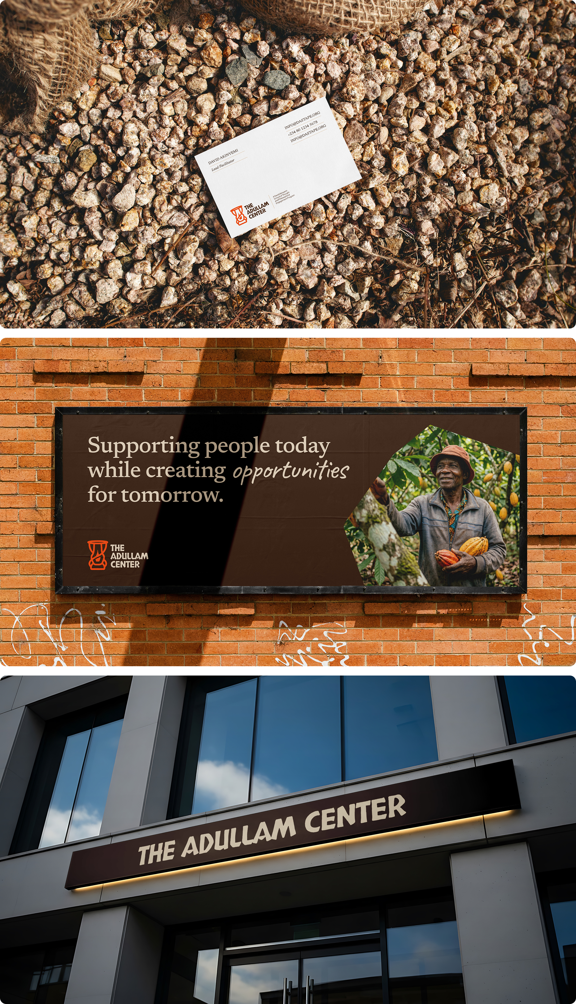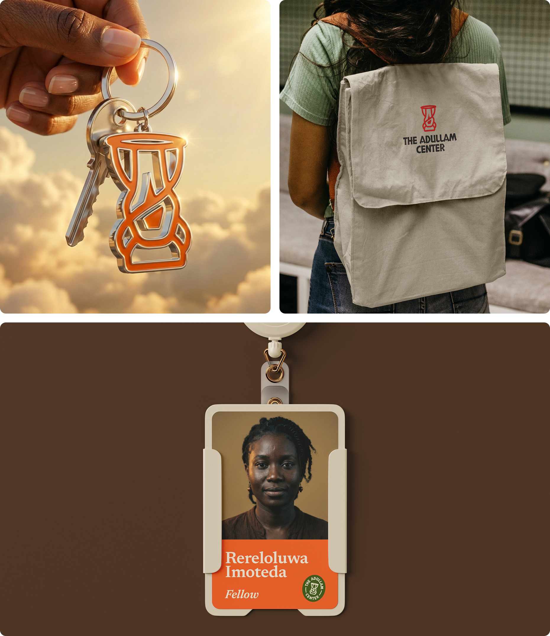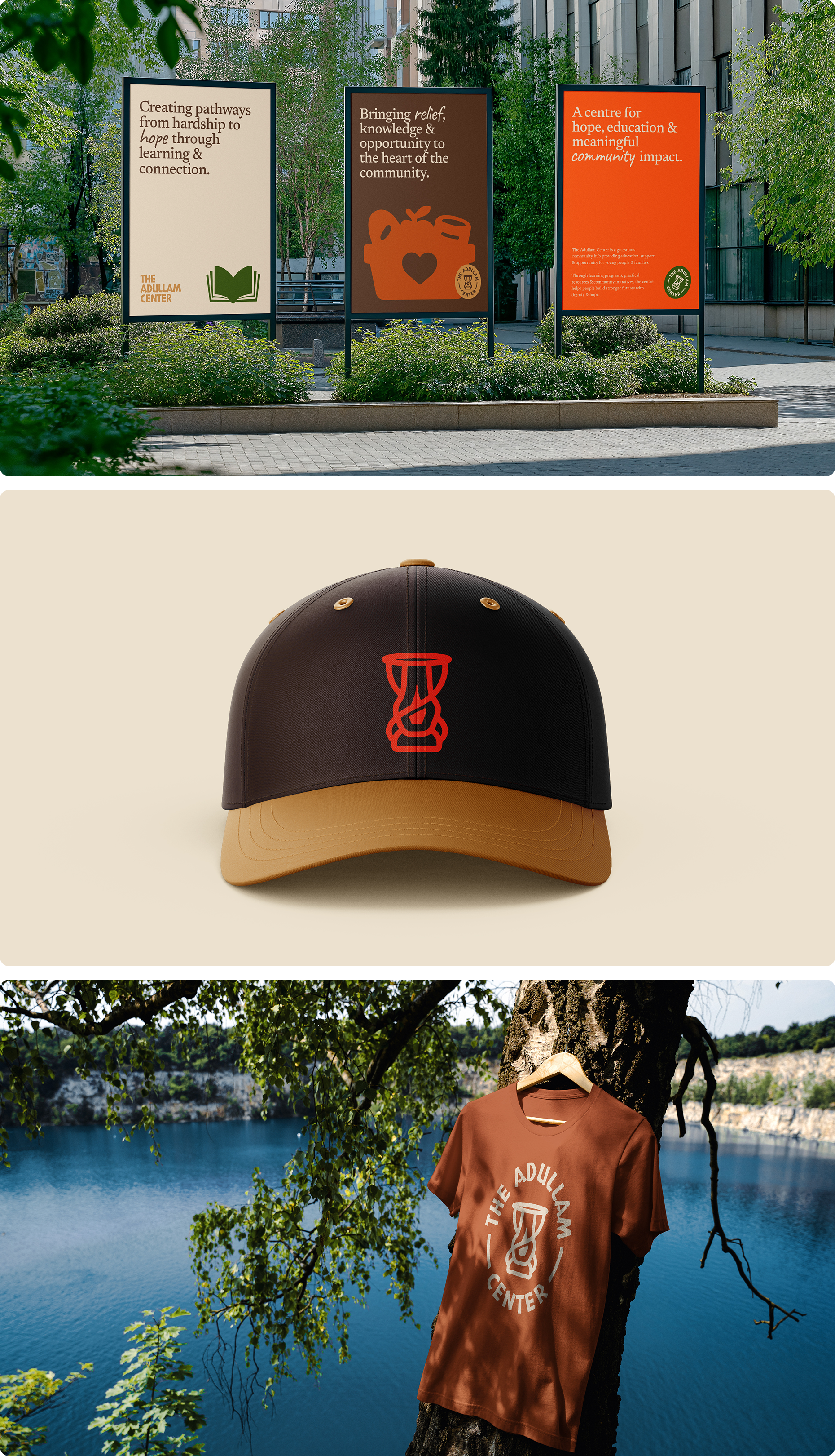
Rooted in a larger parent organization but built to stand on its own, The Adullam Center is a community hub offering counseling, refuge, community support, a charity kitchen, food donations, a library, and tutorial programs for secondary school students — a space designed to receive people at their lowest and rebuild them from the inside out. The challenge was constructing a complete identity — visual and verbal — from the ground up, one that could speak authentically and warmly to three very different audiences: those arriving in need of support, the volunteers and fellows who would facilitate the programs, and the donors whose resources would sustain it all.
The name Adullam references a biblical cave — historically a place of refuge. The instinct to use a cave as the central visual was quickly set aside. It felt too literal, too cold, and too on the nose for a brand whose entire purpose was warmth and hope. The question became: what does refuge actually feel like from the inside?
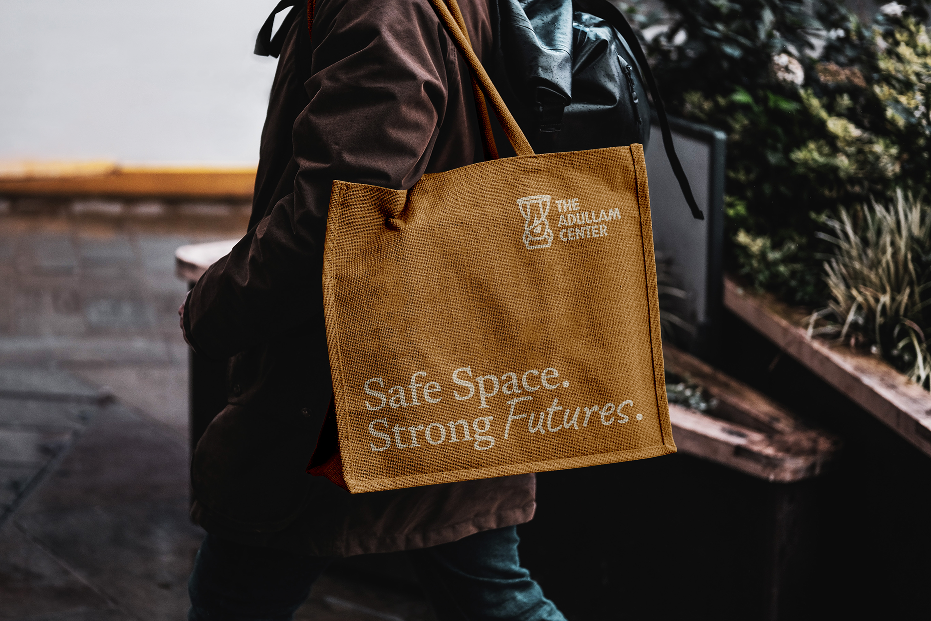
The answer was found not in scripture but in culture. In old Western Nigeria, the kerosene lantern was a deeply familiar presence — carried into dark places, hung at doorways, and gathered around in community. It was a symbol of light in uncertainty, of warmth in the cold, of people finding their way through difficult terrain. That imagery aligned perfectly with everything Adullam Center stood for, and it rooted the brand firmly in the cultural soil of the very community it was built to serve. The lantern became the logomark — communicating hope, enlightenment, and belonging without a single word.
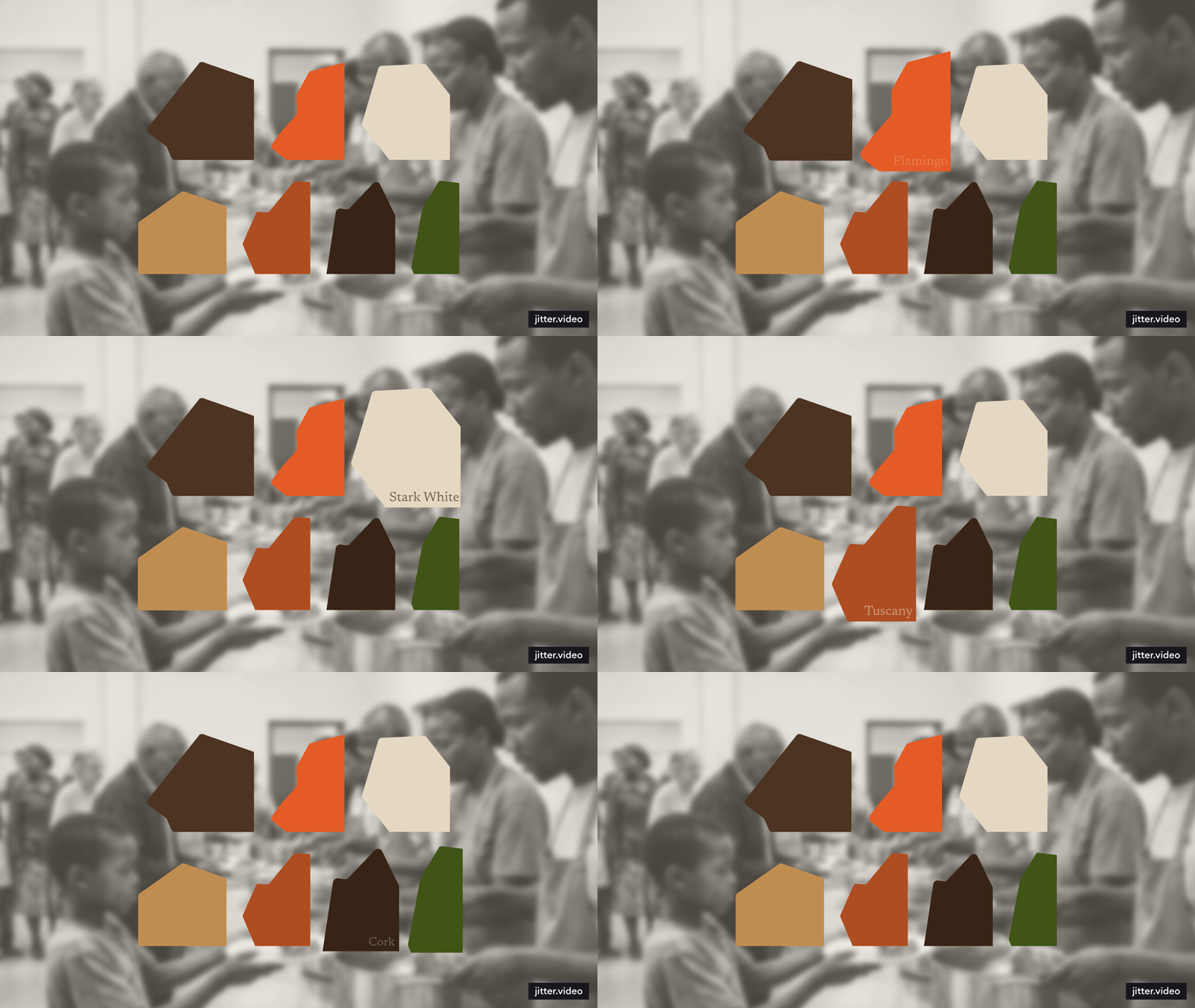
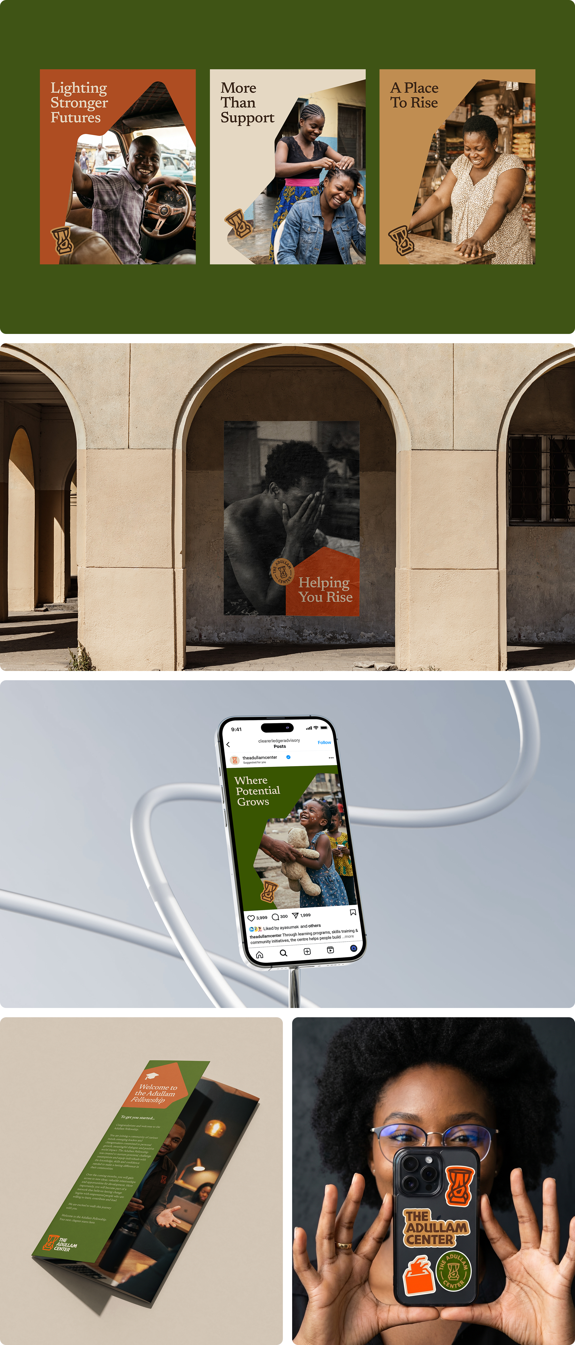
The cultural grounding didn't stop at the logomark. The graphic elements used throughout the identity — frames for text, frames for imagery — were derived from the silhouettes of the mountainous landscape of the region. The connection runs deeper than aesthetics: caves, historically places of refuge, are found within mountains. The mountains of Southwestern Nigeria quietly hold that same symbolism, and pulling their shapes into the visual system created a subtle but meaningful thread between the land, the culture, and the brand's core purpose.
Beyond the logomark and graphic elements, a full visual system was developed covering typography and color — anchored in the same warmth and depth the lantern communicates. The photography direction was also carefully defined as a core part of the identity. Imagery was designed to do two things simultaneously: honestly reflect the reality of those the center exists to serve — people who are broken, struggling, and searching for hope — and just as powerfully capture the transformation that the center's programs make possible. The result is a photographic language that feels human, tender, and ultimately hopeful.
The verbal identity was built around one core truth: The Adullam Center is a place where people are received as they are, built up, and sent back into the world stronger. Every element of the brand voice — from how it addresses its audience to how it describes its programs — was crafted to feel approachable and warm across all three audience groups. Whether speaking to someone in crisis, a prospective volunteer, or a potential donor, the brand needed to feel like a hand extended, not a door half open.
The final identity gave The Adullam Center what it needed to stand on its own — a visual and verbal system deeply rooted in the culture and landscape of Southwestern Nigeria, warm enough to welcome the broken, and strong enough to carry the brand's ambitions long into the future.