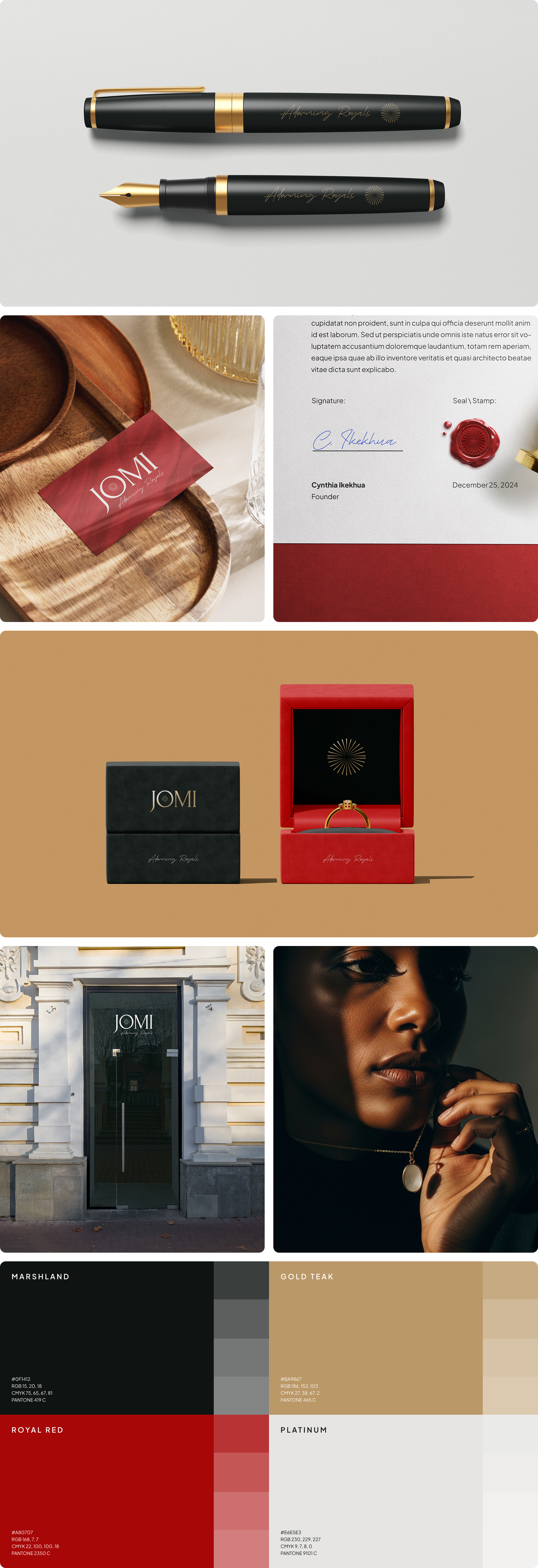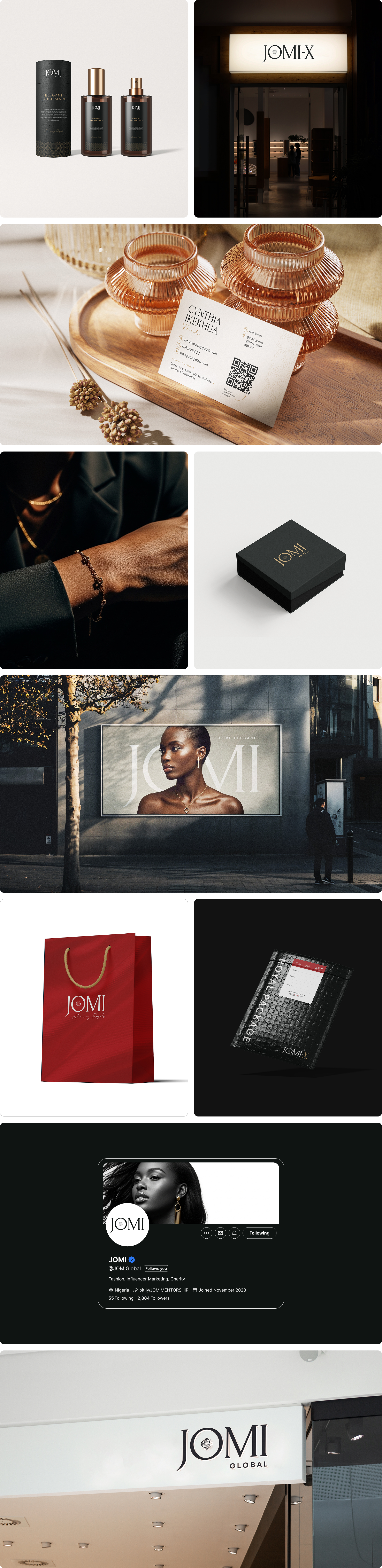
When JOMI first came on board, there was no visual system in place. A luxury lifestyle brand spanning fashion, jewelry, a charity organization, and the personal influencer brand of its founder, Cynthia — a group of closely related ventures operating under one roof — yet the existing logo carried a playful, casual energy that worked against the brand's core positioning. For a brand asking its audience to invest — whether financially or emotionally — the visual identity needed to command trust, sophistication, and desire. It simply wasn't doing that.
An audit of established luxury brands pointed clearly toward one direction: wordmark-based logos with strong typographic character. A serif font was chosen over the sans-serif trend dominating the industry — carrying the weight and elegance luxury demands. To push the mark further, a custom illustration was introduced within the letter "O" — a sparkling, light-catching detail that ensures the wordmark feels crafted rather than simply typed.
With the logo as the foundation, a full visual identity system was built out — covering color palette and typography hierarchy. The sub-brands — the charity arm and Cynthia's personal influencer brand — were not treated as separate identities but as deliberate extensions of the core JOMI system, ensuring cohesion across every touchpoint.
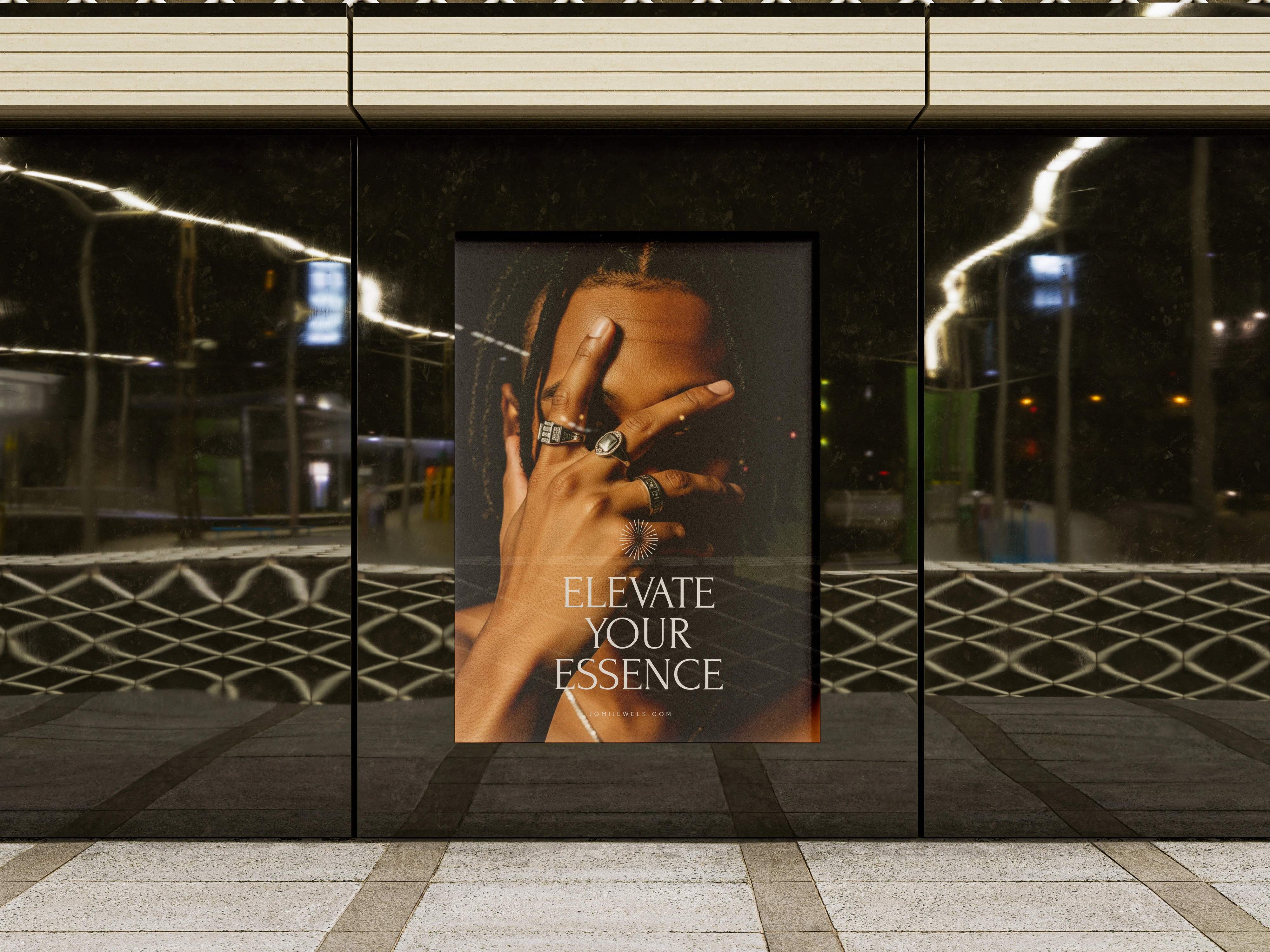
The new identity gave JOMI what it had been missing — a visual language strong enough to carry the brand's ambitions and consistent enough to scale across all its verticals.