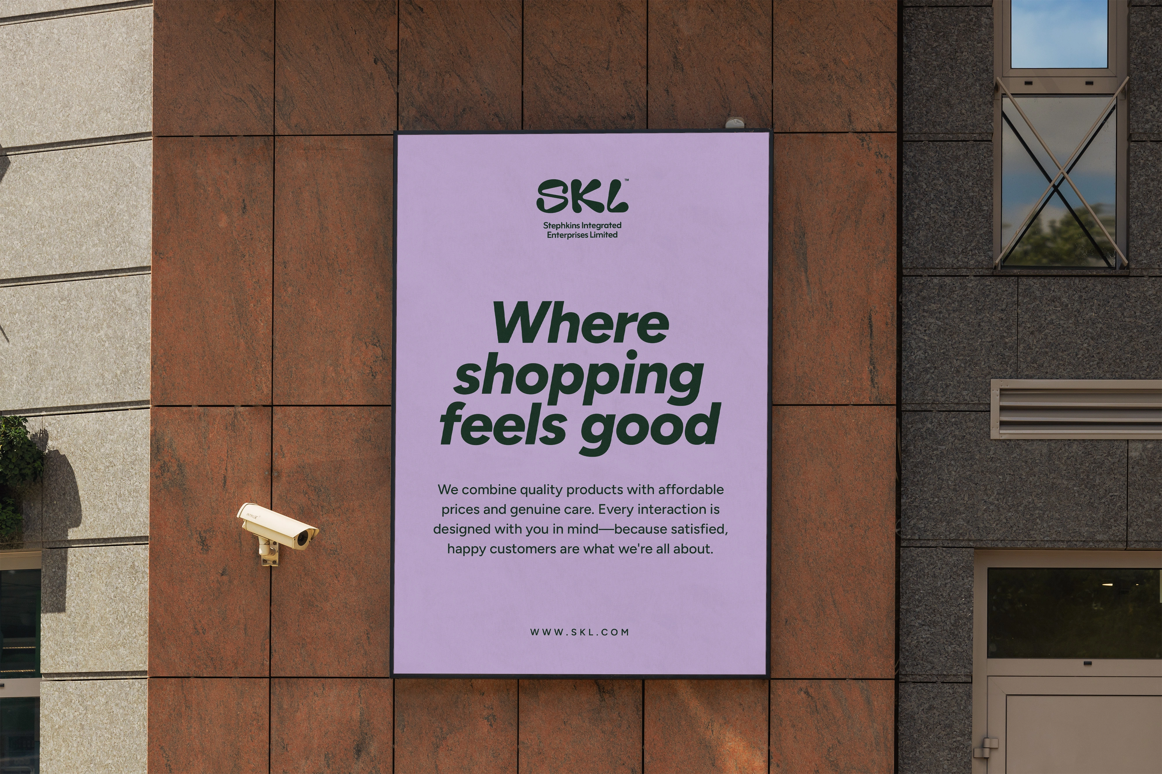
Some brands are built around one thing. SKL was built around everything — a growing range of products spanning food, furniture, and well beyond, with ambitions to keep expanding. The challenge wasn't defining what the brand sold. The challenge was capturing how it should feel: not a cold, corporate marketplace, but a warm, familiar place where people come, find exactly what they need, and leave fully satisfied.
The first instinct was to lean into the shopping bag as a visual metaphor — a symbol of what customers walk away with. But that direction was set aside in favour of something deeper. Rather than showing the outcome of shopping, the goal became capturing the place itself — somewhere approachable, familiar, and full of everything you could need.
That thinking led to a combination mark: a rooftop icon merged with the SKL lettermark. The rooftop communicates shelter, home, and belonging — the idea that SKL is a place you can always come back to. The lettermark sits naturally within it, making the combination feel intentional rather than forced. The result is a logo that feels less like a store and more like a destination.
The final identity struck the balance the brand needed — approachable without being frivolous, warm without being bland. It gave SKL a visual presence that communicates exactly what the brand is: a place where whatever you need is waiting for you.
