Across Nigeria, a quiet decline was being observed — critical thinking among students was deteriorating. DASTAPE, a not-for-profit school of thoughts and philosophical engagement, was founded to push back against that. The challenge was translating something deeply abstract — the value of ideas, conversation, and philosophical engagement — into a visual identity compelling enough to draw students in and communicate the organization's mission at a glance.
The logo became the heart of the work. Rather than reaching for complex imagery, the answer was found in something disarmingly simple — the exclamation mark. That single symbol captures the precise moment an idea is born, the spark of recognition that says something worth exploring has just emerged. From that symbol, the entire logomark was built outward, visually representing how one idea ignites conversation, and how conversation sharpens thinking.
The color palette was built around the idea of richness — the kind that comes when ideas are shared, challenged, examined, and strengthened through dialogue. The colors reflect that depth, giving the brand a visual warmth that feels as intellectually alive as the organization itself.
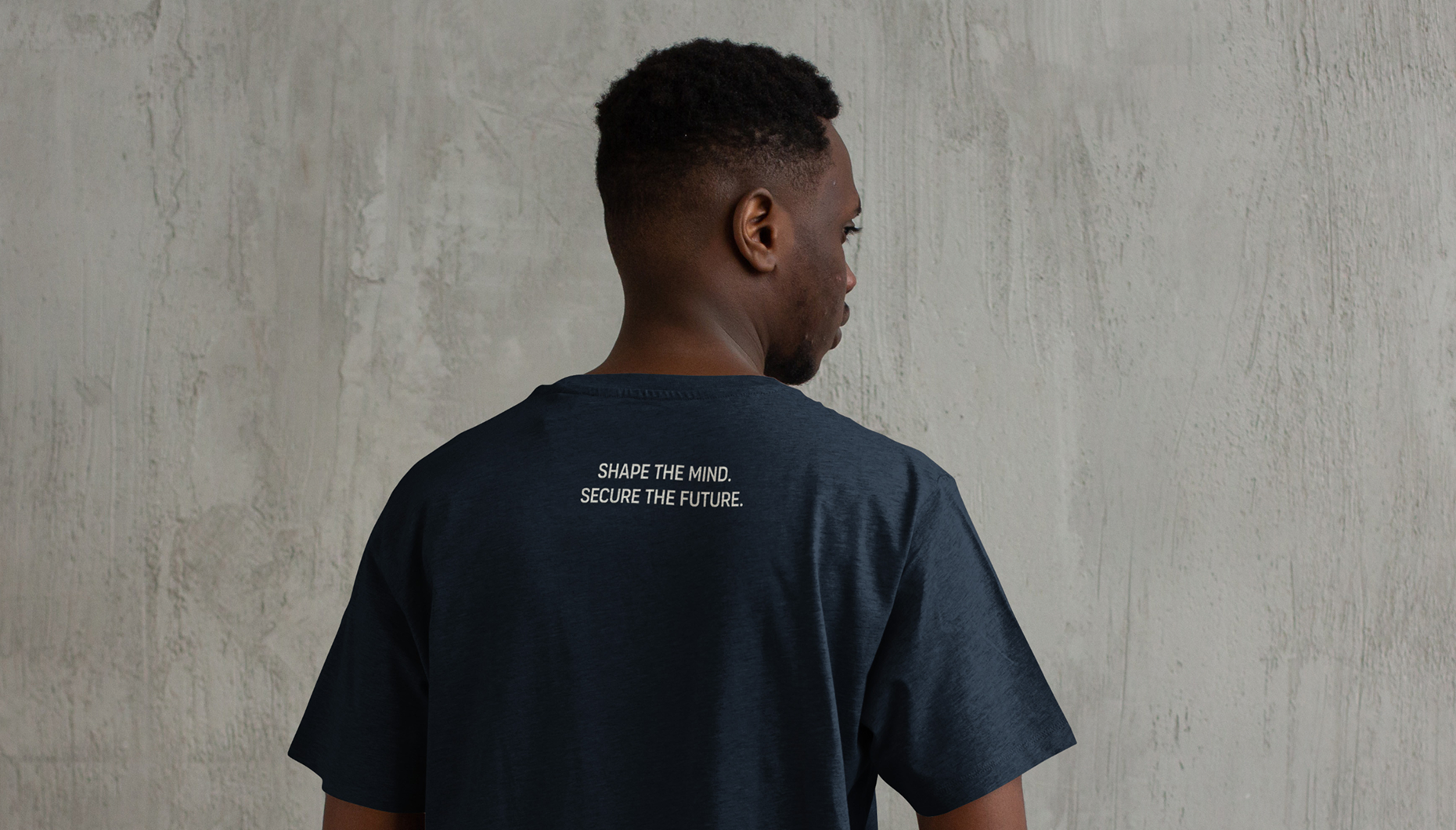
With the brand foundation in place, the work extended into event branding for DASTAPE's Annual Festival of Ideas — a program bringing together secondary school students from across a state in Western Nigeria for maiden critical thinking debates and essay writing competitions. Digital and print materials were produced to cover every touchpoint of the event.
The visual language of the event branding was rooted in the logomark itself. The dot at the base of the exclamation mark — which in certain typographic variations takes the form of a square — became the building block for a layered visual motif. Squares were used to represent layers of ideas being generated, exchanged, and built upon among participants, a pattern that carried across every material produced and tied the event identity back seamlessly to the core brand.
The result was a cohesive identity — from brand to event — that didn't just represent DASTAPE's mission visually but embodied it. Every element, from the logomark to the event materials, told the same story: that ideas, when shared, multiply.
