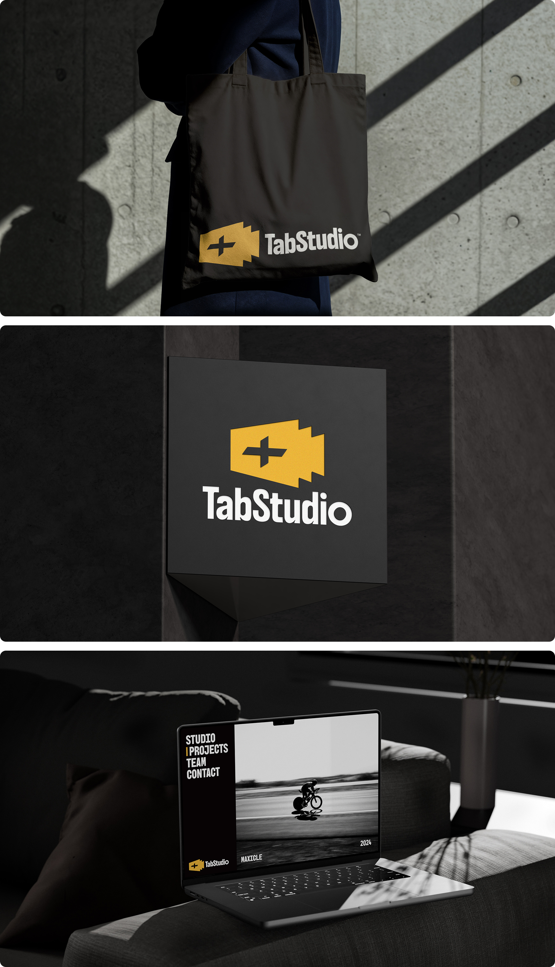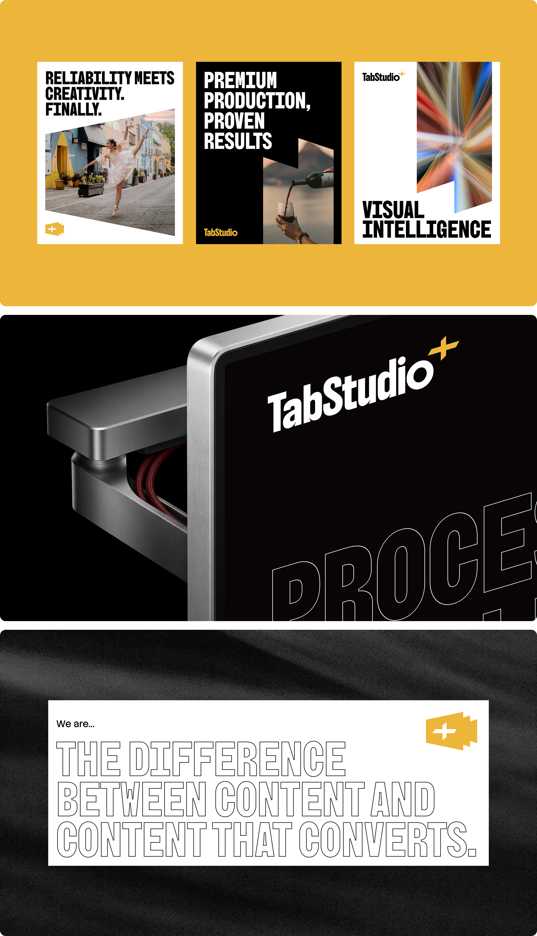
TabStudio sits in a crowded space — freelancers who disappear, agencies that overpromise, and studios that lead with visuals over strategy. As a premium video production and media design agency serving SaaS companies and C-Suite executives, TabStudio needed a logo that could immediately communicate what sets it apart: precision, reliability, and a strategic mindset that goes deeper than the brief. The mark had to feel as deliberate and premium as the service itself.
The logomark was built from overlapping rectangular forms representing film frames and video layers — a direct reference to the studio's craft. At the centre, a bold cross symbol was introduced, communicating the addition of value and the spirit of collaborative partnership that defines how TabStudio works. It also carries a quieter reference to precision and alignment — qualities as central to strategic thinking as they are to video production.
The wordmark uses a bold geometric sans-serif — confident and grounded, with just enough roundness in the letterforms to remain approachable without sacrificing the premium edge the brand demands.
Warm gold and solid black. Gold sits at the intersection of creativity and excellence — energetic enough to feel bold, refined enough to feel premium. Paired with black, it creates strong contrast and versatility across every application. The result is a palette that feels as deliberate as the thinking behind it.
The final mark gave TabStudio a logo that does exactly what the brand promises to do for its clients — lead with intention, communicate with clarity, and deliver something that works beyond the surface.