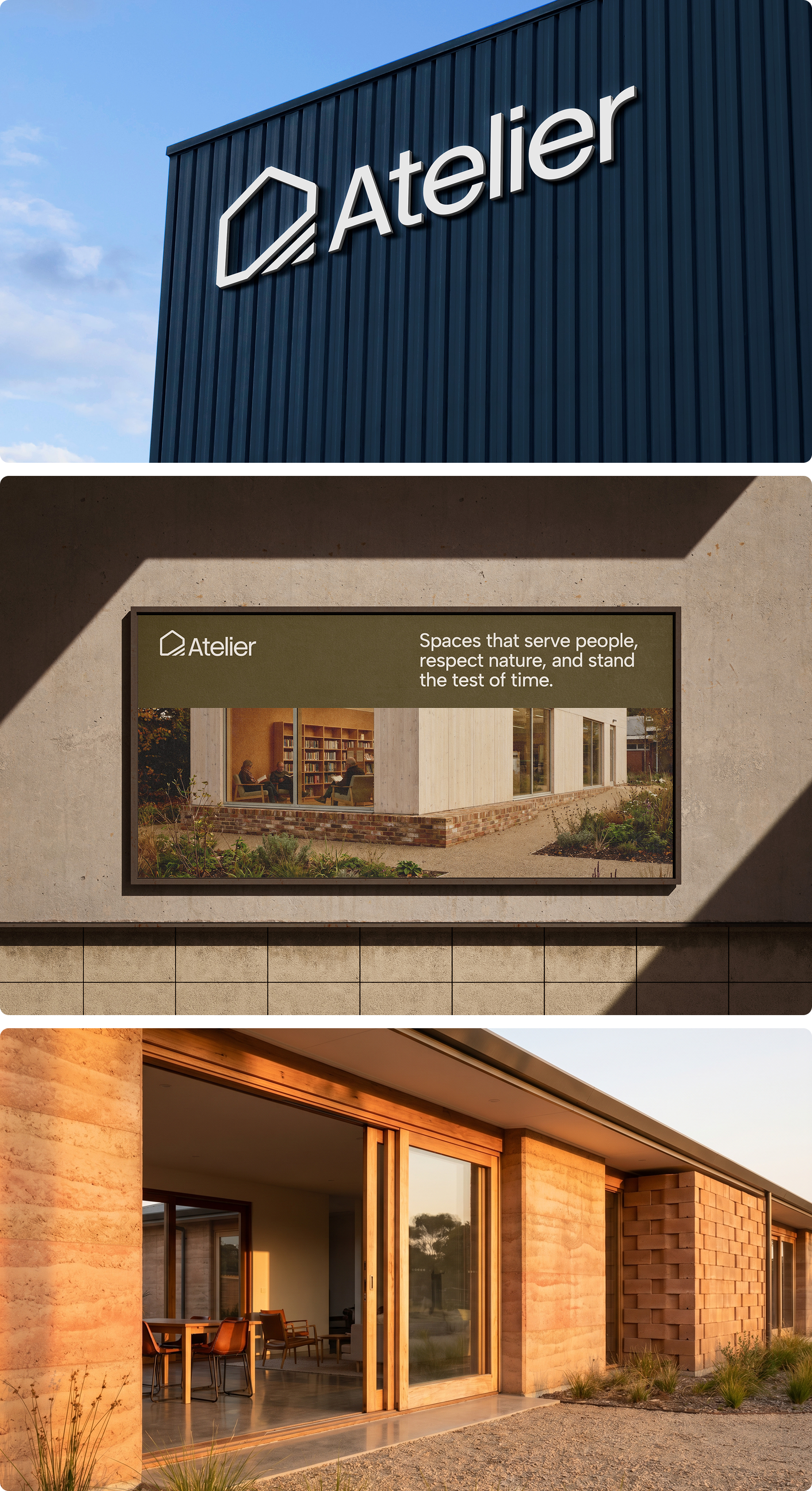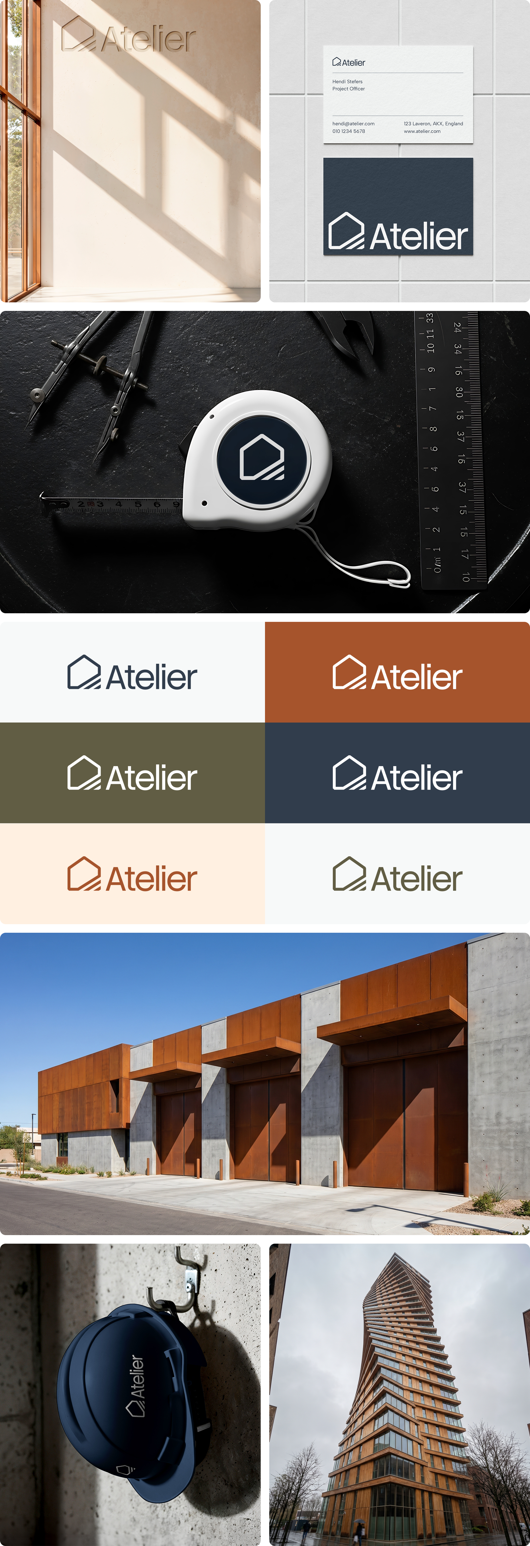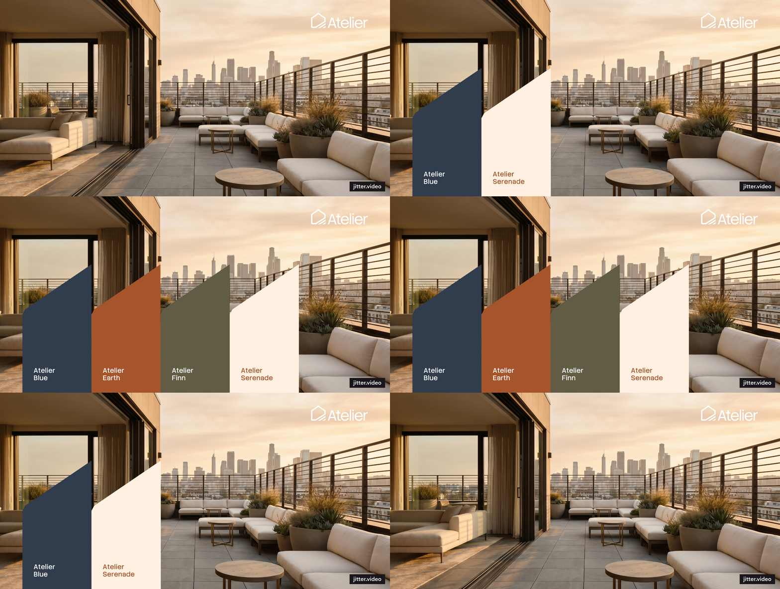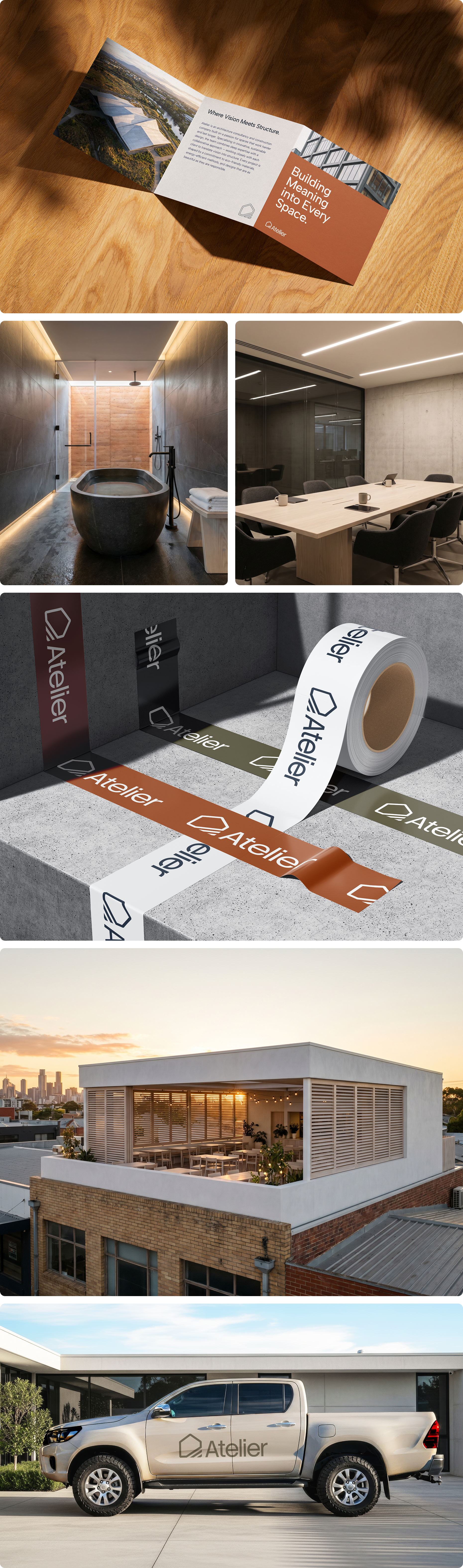
Atelier is an architecture consultancy and construction company with a clear conviction: that innovative, sustainable spaces don't require excess — they require intention. Founded by experienced architects and construction professionals passionate about designs that are functional, beautiful, and environmentally responsible, the challenge was translating that philosophy into a logo that could communicate it at a glance. The mark needed to feel as considered and deliberate as the structures Atelier builds.
The direction was rooted in the same principles the brand builds by — do more with less. Rather than layering complexity into the mark, the logo was constructed using strokes alone. The simplicity of the stroke work was a deliberate choice, mirroring the idea that outstanding structures don't demand extravagant materials. They demand the right materials, used with skill and intention. The result is a logomark that feels architectural in its very construction — minimal, structured, and quietly confident.
The final mark communicates exactly what Atelier stands for — that sustainability and innovation are not achieved through excess, but through the precise, purposeful use of what is available. A logo as considered as the buildings the brand was built to create.